

-
I can't wait to see yours, LT! Thank you both for that! It isn't necessarily the details that make me want to wring something's neck, it's the system choking on itself while I'm tweaking things. Which is why it's in layers. There's less choking that way.
This poor boy is gonna end belly up in a year or so. Then I'm out of commission completely except for the traditional mediums. *shrug*
"I didn't attend the funeral, but I sent a nice letter saying that I approved of it. " Mark Twain. -
I think I've UV mapped the backpack five times...and some weird stuff went on when I used the mirroring in Silo to mirror materials--left and right ends got put together, but middle bits vanished, so I had to go back and clean that up.
* A child of five could understand this. Fetch me a child of five!
* Isn't it wonderful how cute weapons of mass distraction can be?
* Those are my principles. And if you don't like them, I have others. -
Still a ways to go, but it is coming together. Just felt like showing some of the progress. :)
-
* A child of five could understand this. Fetch me a child of five!
* Isn't it wonderful how cute weapons of mass distraction can be?
* Those are my principles. And if you don't like them, I have others. -
-
Because, yanno, I had to make it HARDER. And every girl needs an ammo accessory belt.

 7-8-2012 12-14-08 PM.jpg573 x 797 - 225K* A child of five could understand this. Fetch me a child of five!
* Isn't it wonderful how cute weapons of mass distraction can be?
* Those are my principles. And if you don't like them, I have others. -
Meantime, I thought maybe I'd have a second, less visible "belt" hip part of the harness. All you'd see is the attachment on the sides, really, of that hip.
As such: * A child of five could understand this. Fetch me a child of five!
* Isn't it wonderful how cute weapons of mass distraction can be?
* Those are my principles. And if you don't like them, I have others. -
Thank you. :)
This is inspired by the Aphrodite IX pic, of course, but I'm kinda going to town with it. I'd like to be able to have the pieces serve more than one use. Backpack will parent to the chest of the harness, but you could use the harness for other stuff. The bandolier belt could be used as accessory, too.
* A child of five could understand this. Fetch me a child of five!
* Isn't it wonderful how cute weapons of mass distraction can be?
* Those are my principles. And if you don't like them, I have others. -
Nanobot said:
Wow, that's a great image to pick, Raet! :D
Thanks. Here is how for I got. I didn't really want Conan himself or that monkey man so I used two of my figments that haven't seen the light of day together in a while. I thought a slight sepia tinge to it worked...
 Conan2.jpg800 x 1110 - 606K
 -
Love the image and you have a good start here, Raet. Your front-most character could use a touch more light. He's fading into the backdrop a bit too much. If you are going for an exact replication of the image provided (if not ignore), then your sword-weilding guy needs to shove in a bit more to the left to carry the eye upward in the same curving line that the original does. You have a similar feel now, but it's a looser line. Might benefit from that simple little push to the left.
-
LT_Roberts said:
Love the image and you have a good start here, Raet. Your front-most character could use a touch more light. He's fading into the backdrop a bit too much. If you are going for an exact replication of the image provided (if not ignore), then your sword-weilding guy needs to shove in a bit more to the left to carry the eye upward in the same curving line that the original does. You have a similar feel now, but it's a looser line. Might benefit from that simple little push to the left.
Yes. With the sword itself. Justify the movement of the sword in line with the reaction-movement of the guy at the bottom (who appears to have been hit by the hero (?) ), and align them all so the eye is guided by the flashing sword up to the villain.
Does that do it, LT?
Suspiro ergo sum. -
Sword is fine for me, it's more the placement of the figure itself. Just a little too far to the left. As I say, it's only if Raet is trying to do exactly what is in the image. What he has is quite close, but I do think the gap between the sword wielding character and his foes might seem more dynamic if they were just a smidge closer to each other.
-
Another little tidbit tease, just because I got it finished and I'm not sure when I will have time to wrap up the rest (so much more to overpaint, because of crummy textures in the backdrop!). Only the hair painting left to do on the Hulk itself, which I may get done tonight (maybe). I am adding in some painted specular on parts of his body and I want to add a layer of dirt and grime to the skin too. But one step at a time. I only get an hour or so here and there, plus I am taking my time with this to push my abilities further (and try to stay patient with it).Anyway, that's a long-winded way of saying, here's his face! :D

 Screen shot 2012-07-10 at 11.38.39 PM.png375 x 407 - 251K
 -
Just to show you how much I've done to get the look right, here's the raw render of his face.
 He came out a tad too yellow when I rendered it, in part to the high contrast light, in part because it's very hard to get that green looking right. It changes in every frickin' light situation (believe it or not, the base texture is closer to the one I've tweaked!). I gave up on trying to fix it in Poser and made a quick adjustment (minutes instead of hours) in Photoshop. I have also added more structure, highlights, shadows, wrinkles, definition, specular, and detail to come out with something that feels more 'finished'. This is what I am trying for. The backdrop is really giving me grief so I am likely going to blur it out (it also helps pop Hulk out of the scene, by giving it depth), and obscuring it with smoke, fire and sparks. At least, that's where my brain is right now.Hope a peak at what I do proves helpful. Feel free to ask questions.
 Screen shot 2012-07-11 at 7.55.40 AM.png261 x 255 - 111K
 -
LT's Hulk face is really tasty! Mmm, greens.
Raet, good start.
The composition is troubling me as the various characters are not interacting very well. There are several ways to address that, but experimentation is needed. You can use visual contrasts well as the figures' lines of sight to direct the eye. Group poses like this are tricky to get working, but hey, this is learning experience. One way is to have body lines going toward actors other than the character is looking at, but that may indicate the wrong sort of thing here.
Another way to get them to interact is to use the lines in the overall composition. You pretty much replicated the poses--nice!--but it's the length of that pillar and the more extreme verticality of the villain's and marauders' positioning that makes the original work as it does.
* A child of five could understand this. Fetch me a child of five!
* Isn't it wonderful how cute weapons of mass distraction can be?
* Those are my principles. And if you don't like them, I have others. -
Nanobot said:...but it's the length of that pillar and the more extreme verticality of the villain's and marauders' positioning that makes the original work as it does.
Actually, it's the golden mean again.
What makes the characters on the lower tier look like they're interacting with the characters on the upper tier, even though their actual interaction is negligible. By arranging the scene so it follows the golden mean, it gives a flow to the overall composition that links all the characters together.
 Image31.jpg1600 x 2721 - 1M
 -
The original composition also uses forced perspective. Note that the female and the wizard are illustrated about the same height as Conan and the enemy fighters - but if they're all about the same size (and thus at the same distance from the eye), then how does Conan fit beneath that ledge? It's a forced perspective - the villain's staff is likely two yards or so behind Conan's head, but we're given a forced perspective to bring him closer so as to allow greater drama to the scene.
-
More comic style: Forced perspective and exaggerated poses, too--everything is extra extra dramatic. ^_^ See how far over his left shoulder Conan's head is? And see the Elfy Guy's head with respect to his shoulder? Conan's pose is a bit beyond reasonable.
* A child of five could understand this. Fetch me a child of five!
* Isn't it wonderful how cute weapons of mass distraction can be?
* Those are my principles. And if you don't like them, I have others. -
Nanobot said:
More comic style: Forced perspective and exaggerated poses, too--everything is extra extra dramatic. ^_^ See how far over his left shoulder Conan's head is? And see the Elfy Guy's head with respect to his shoulder? Conan's pose is a bit beyond reasonable.
I actually tried that one but the neck looked horrendous. No wonder Conan has long hair: it hides all manner of sins. -
Totally fitting. Love the pulp look!
-
Xaa said:
There you go. ;-)
Thanks. Just because I can, here is the raw render. The render artifacts on the upright stone were a bit of a shock initially but the clone brush came to my rescue. Handy hint: the clone stamp tip can be changed to different brush heads so it will produce irregular shapes if you pick a "steam" brush head, which makes it harder to spot repetitive patterns.
 Conan2bRaw.jpg870 x 1207 - 683K
 -
Looks much better, Raet! And you've come a long way since your start with post-work. The difference is quite drastic and elevates the piece nicely.
-
I love Stjepan's work Raet and when he posted that I immediately thought 'comic challenge' as well. You did a great job with your interpretation.
So here's my take on Madam Mirage. Not exactly comic style, but she has the pose (and Jim's Fedora! :) )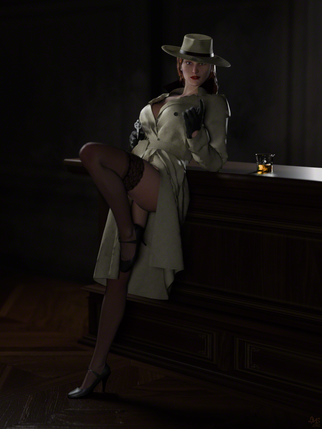 And just for laughs my WIP.... which is nothing like the final version :D
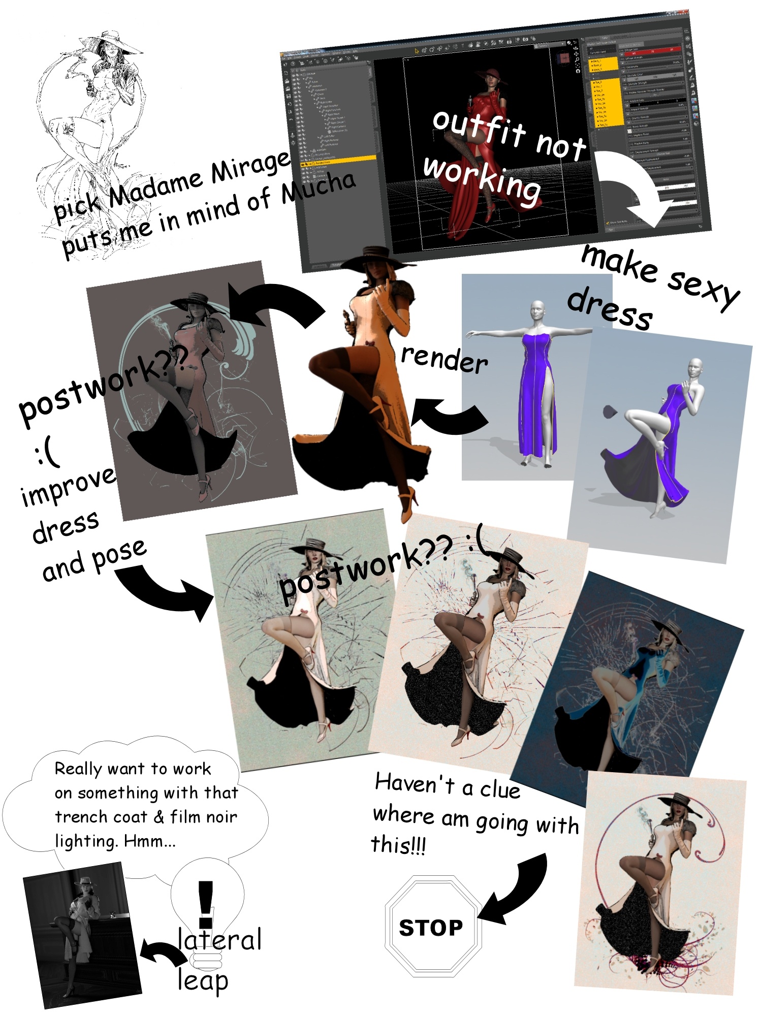
-
Nice one, Dyla. Love the coat and the glass. Damn that glass looks real. As does the way the light reflects onto the counter underneath it. That doesn't look like Firefly engine. And if it is, bravo!I am SOOOOO close to being done my entry. I had hoped to knock it out tonight, but of course, the perfectionist in me said "Not. Done." One last stab tomorrow night (I hope) and I'll be able to post the final version. Just a lot of fiddly things like smoke, lens blur and a few other tidbits left to go. The final is pretty close to what I had intended to do, so I'm pretty happy... but you'll see for yourselves soon enough. :D
-
Okay, so I could fiddle with this until the cows come home, but I think I am finally satisfied. I may revisit just to make this into a wallpaper, but here is the final result. I've really tried to push myself beyond what I've done before (maybe to you it's incremental, but I did many things differently than I have before). Hopefully, the effort is visible! :DAs I said before, the original's camera angle is VERY different, mainly because that angle is physically impossible to reproduce. So I concentrated on getting the pose and the spirit of the piece right.Many thanks to Xaa for making the street lamp and parking sign into bendable/poseable props, as they helped elevate the backdrop from rubble into something a little more interesting. :)Hope you guys like it...HULK SMASH!

-
As always, Hulk looks just a touch sad--I always liked that about Hulk. Effing brilliant painting, LT!
* A child of five could understand this. Fetch me a child of five!
* Isn't it wonderful how cute weapons of mass distraction can be?
* Those are my principles. And if you don't like them, I have others. -
Thanks, Nan! I figured I'd post the original so people can see just how far he really did come.I literally overpainted/retouched pretty much every square inch of this piece. The original was also the wrong colour, but was close enough that I knew I could make a quick adjustment to the overall tone in Photoshop.Here's the original...

 hulk_test4.png834 x 1162 - 2M


Howdy, Stranger!
It looks like you're new here. If you want to get involved, click one of these buttons!